Go with the Flow
As any home DIY-er comes to realize sooner or later, these ventures are expensive! For the average homeowner taking on the renovation of an entire house, there’s likely no quick snap of the fingers where cash comes falling from the sky and all of your wildest renovation dreams come true. As much as we’d all love to have every project completed in one fell swoop, the reality is that many of us go room by room with a list of priorities and a budget attached to each of them.
In my home, the bathrooms have taken a back seat as my budget is used for more predominant areas and large scale projects. The guest bathroom in particular hasn’t quite made it to the top of my renovation list. However, in a house where entertaining is an ongoing theme, I wanted to give this space some love that helps guests feel welcome, and the room feel aesthetically connected to the rest of the home.
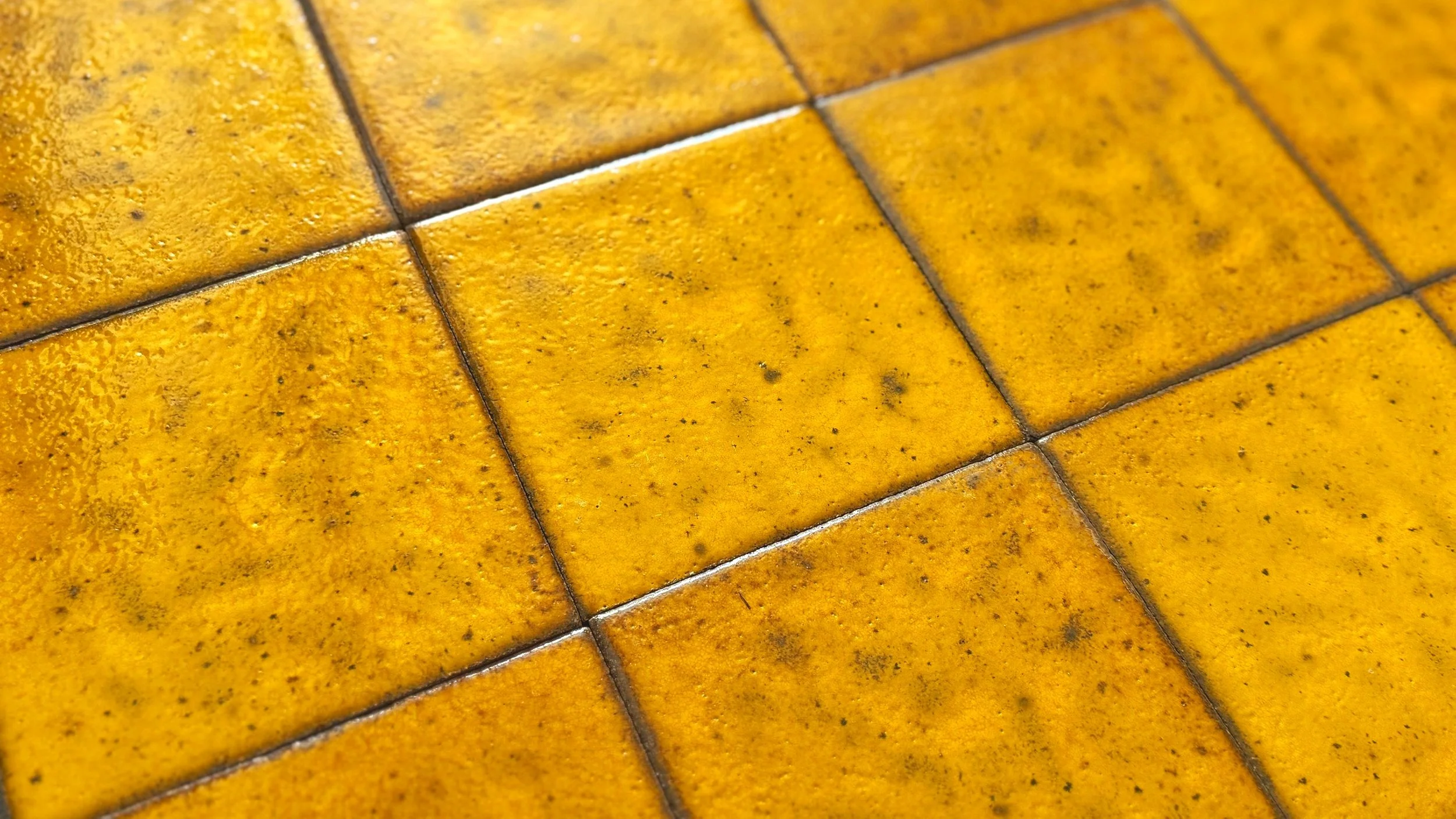
My ideal plan is to install a new countertop, undermount sink, a collection of vintage Japanese tile in the shower, matte black fixtures, possibly a skylight…the list goes on. It can sometimes be difficult to see past the current space you have, but rest assured, there are budget-friendly improvements that can make a world of difference allowing you to see your bathroom in an entirely new and refreshing way while you wait to take on more extensive renovations at a later date. I’ve assembled a few cost-effective solutions I applied to my guest bath for your consideration.
Paint
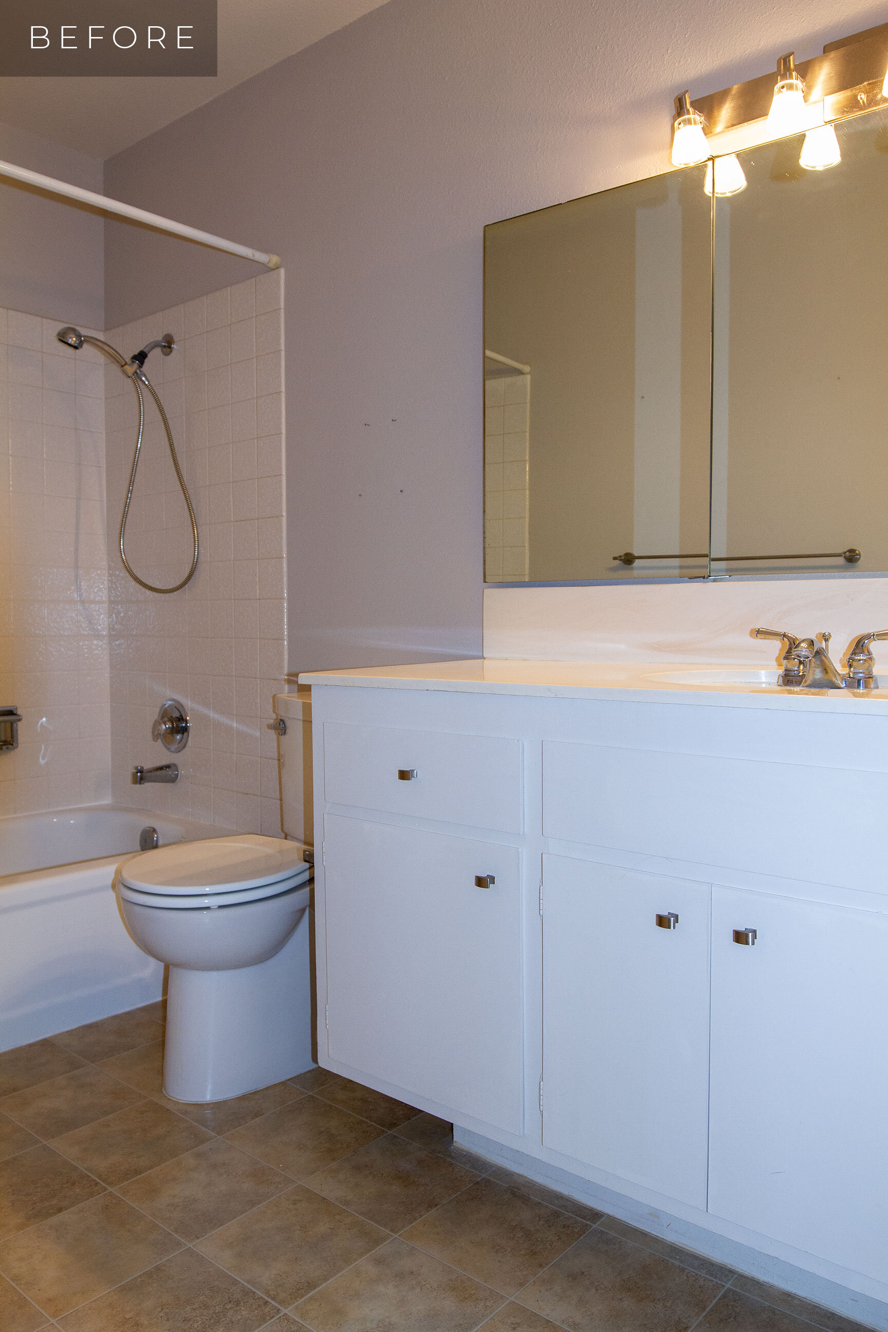
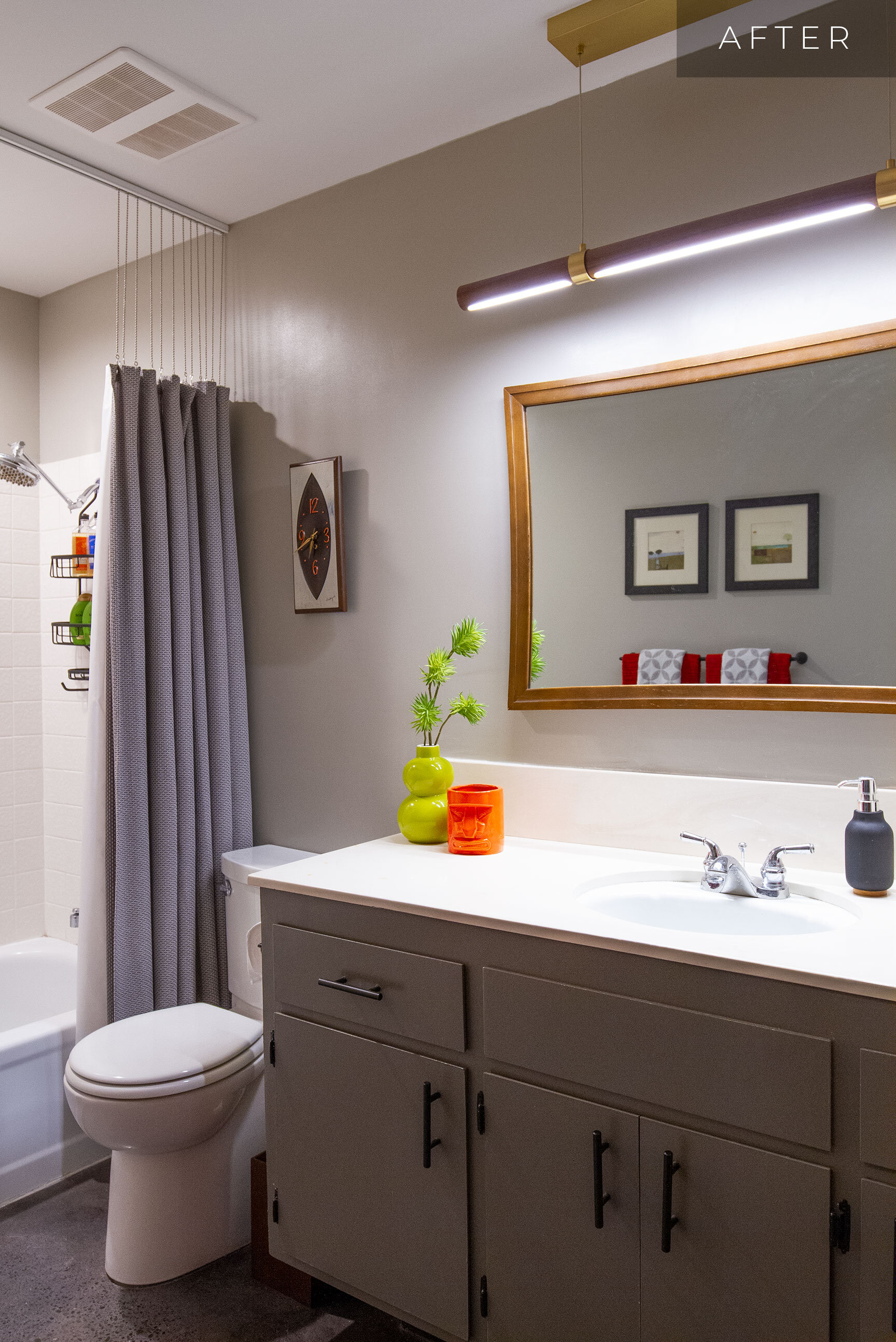
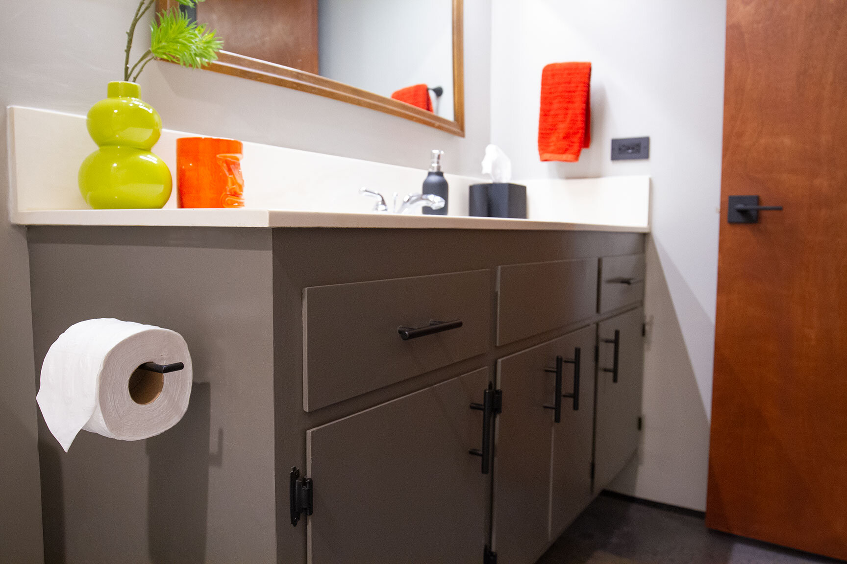
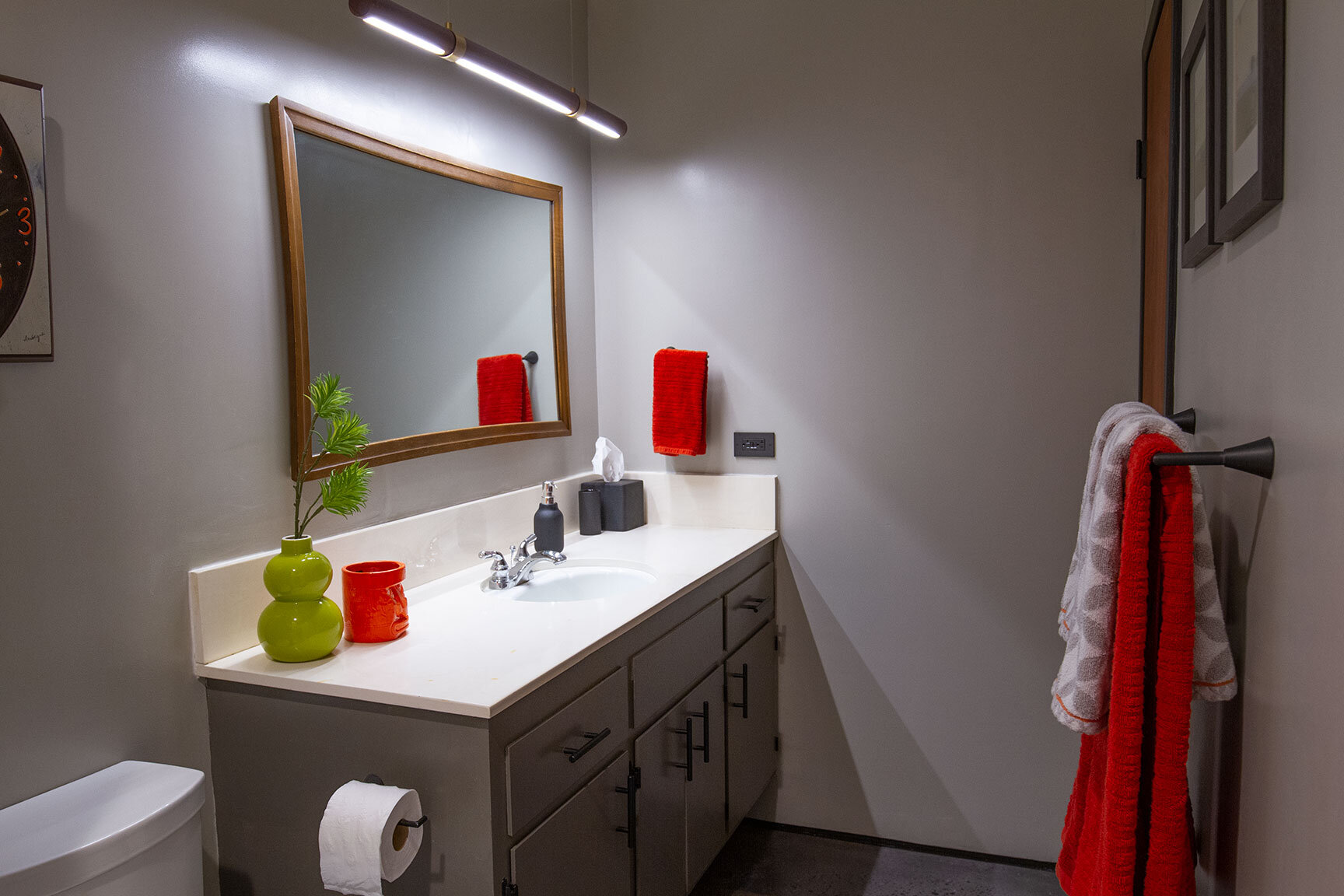
You’ve heard it time and time again, paint is an affordable way to change any space — and it’s true. Color and definition were brought into the guest bath by painting the vanity a warm Gauntlet Gray. This anchors the space, making it a focal point upon entering. The toe kick was painted Black Magic to give it a floating effect (a technique I’ve used throughout my home). The walls were updated from a violet-gray with a fresh coat of Mindful Gray for a warmer tone-on-tone effect that ties together the palette throughout the house.
Countertops & Tile
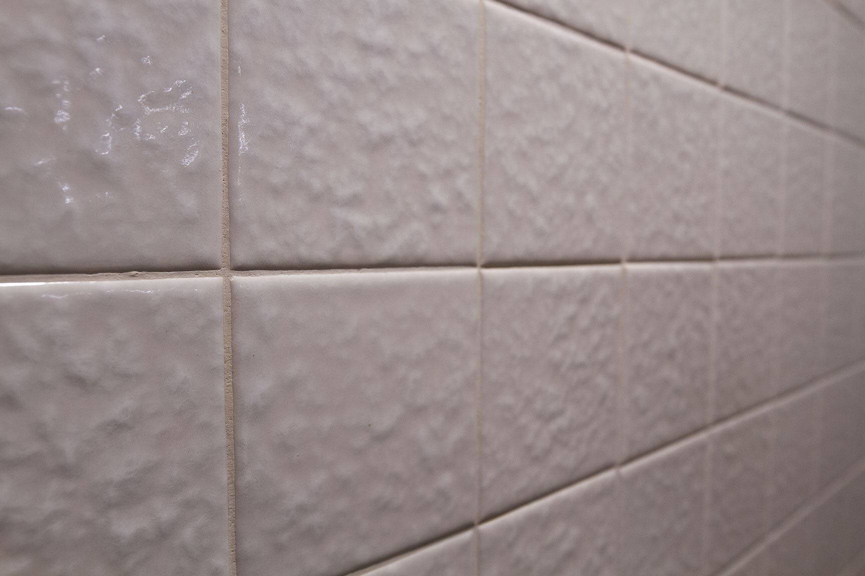
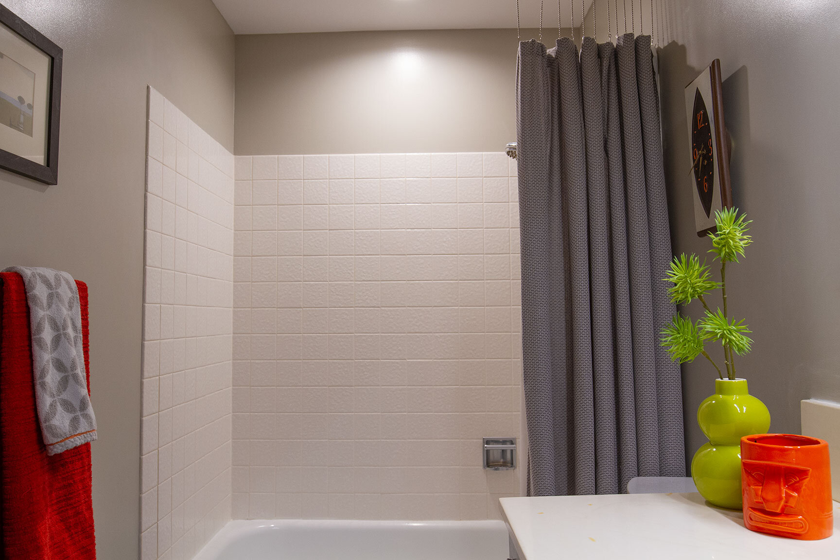
Not every homeowner sees “improvements” as you do. Whether original features or modifications made over the years, it’s common to feel some anxiety over less than desirable finishes that were put in before you acquired your home. Countertops and tile are a prime example. My vanity has an ivory-colored cultured marble counter that I’m not exactly thrilled about. The original tile surrounding the shower is in excellent shape, and very clean. Is it my ideal shower tile? No, but can I live with it? Absolutely! Ask yourself these questions when you feel overwhelmed by your renovation and budget concerns. Just because you can’t replace a material right now doesn’t mean you can’t do anything to your room in the meantime. Embracing what you have and working with it instead of against it will save you a chunk of change that you can put toward more pressing projects. In the meantime, you’ll have a livable space that feels fresh and inviting.
Lighting
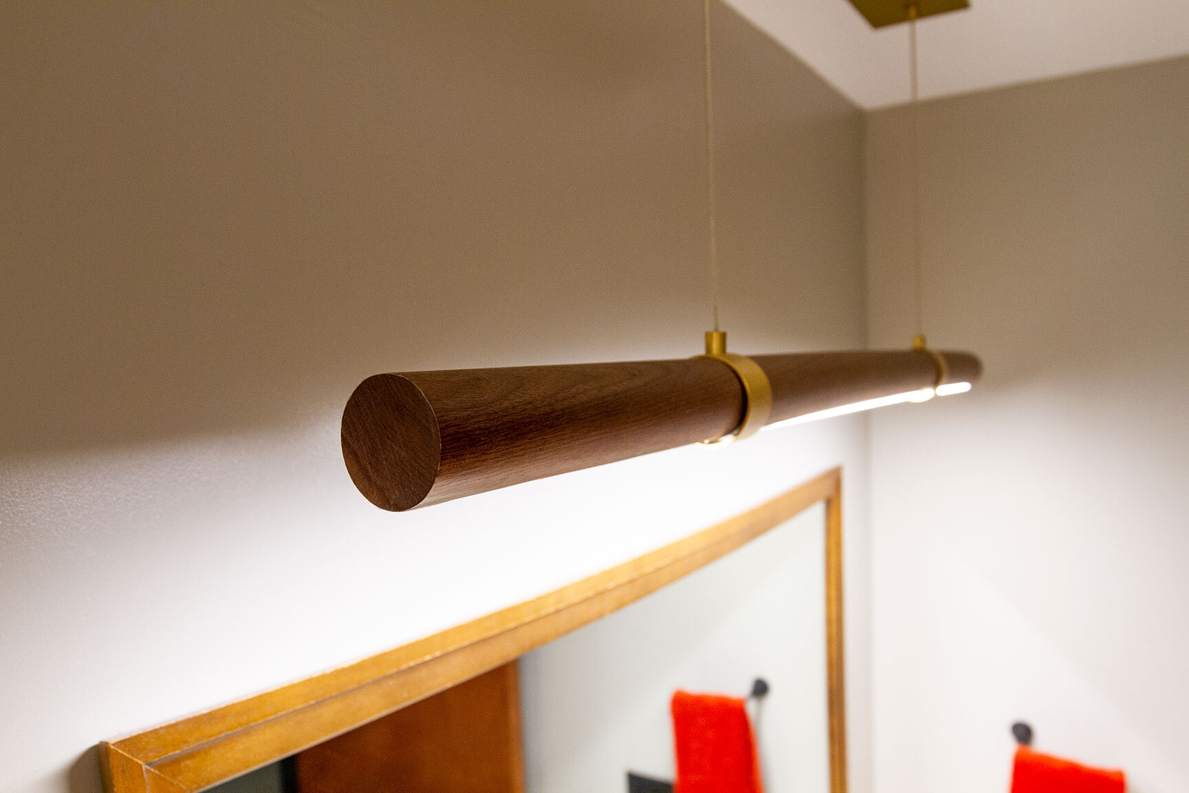
An original Streng Bros. bathroom would have had a dark wood box valance surrounding a fluorescent light tube over the vanity. As much as I would have loved to have retained the original fixture, it was long gone before I got my home. I wanted to make a nod to this fixture with a modernized, minimal twist. The linear wood pendant provides ample light, and the walnut casing with brass accents give a warm, vintage-modern feel. The elongated shape mimics the shape of the original rectangular fixture, but in a lighter, airer profile. There are many options when it comes to lighting, and plenty of affordable solutions to give you the mid-mod vibe you are going for. Whatever fixture fits your preference, make sure it provides ample lighting for bathroom use.
The guest bath is on the interior of the house, and does not have a window. The lack of light from just one fixture made for a somewhat blind shower experience, so I chose to cut in a recessed LED overhead. The connection taps in to the adjacent ventilation fan, so flipping the wall switch turns on both. Let there be light…and air!
Fixtures
This is one area where your budget can be blown in a single purchase. Shiny chrome faucets are not my thing, and they don’t tie in to any other fixtures in my home. Make no mistake, I’m looking forward to the day the sink and shower faucets get replaced. However, with some of the surrounding improvements, these fixtures become less of an eyesore, blending into the background. Ask yourself if you can live with the fixtures you have. Calling attention to other areas of your space with striking lines and strategic color can often draw attention away from the things that feel out of place.
Hardware
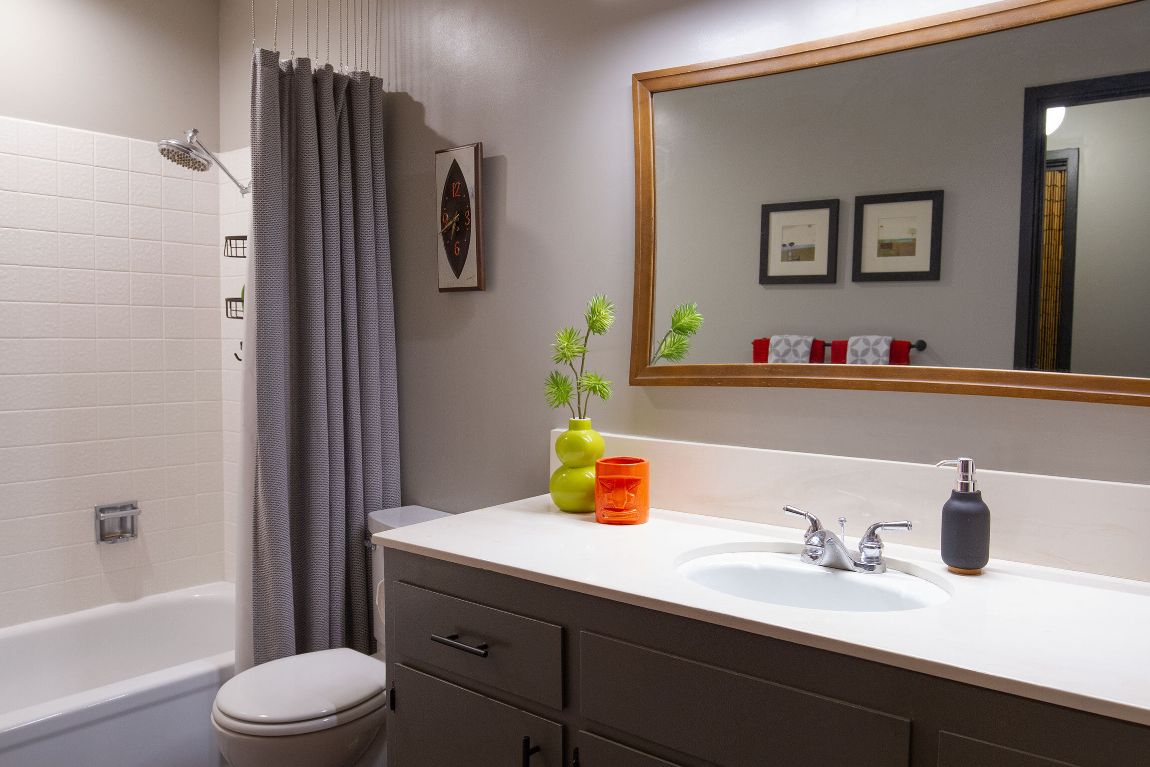
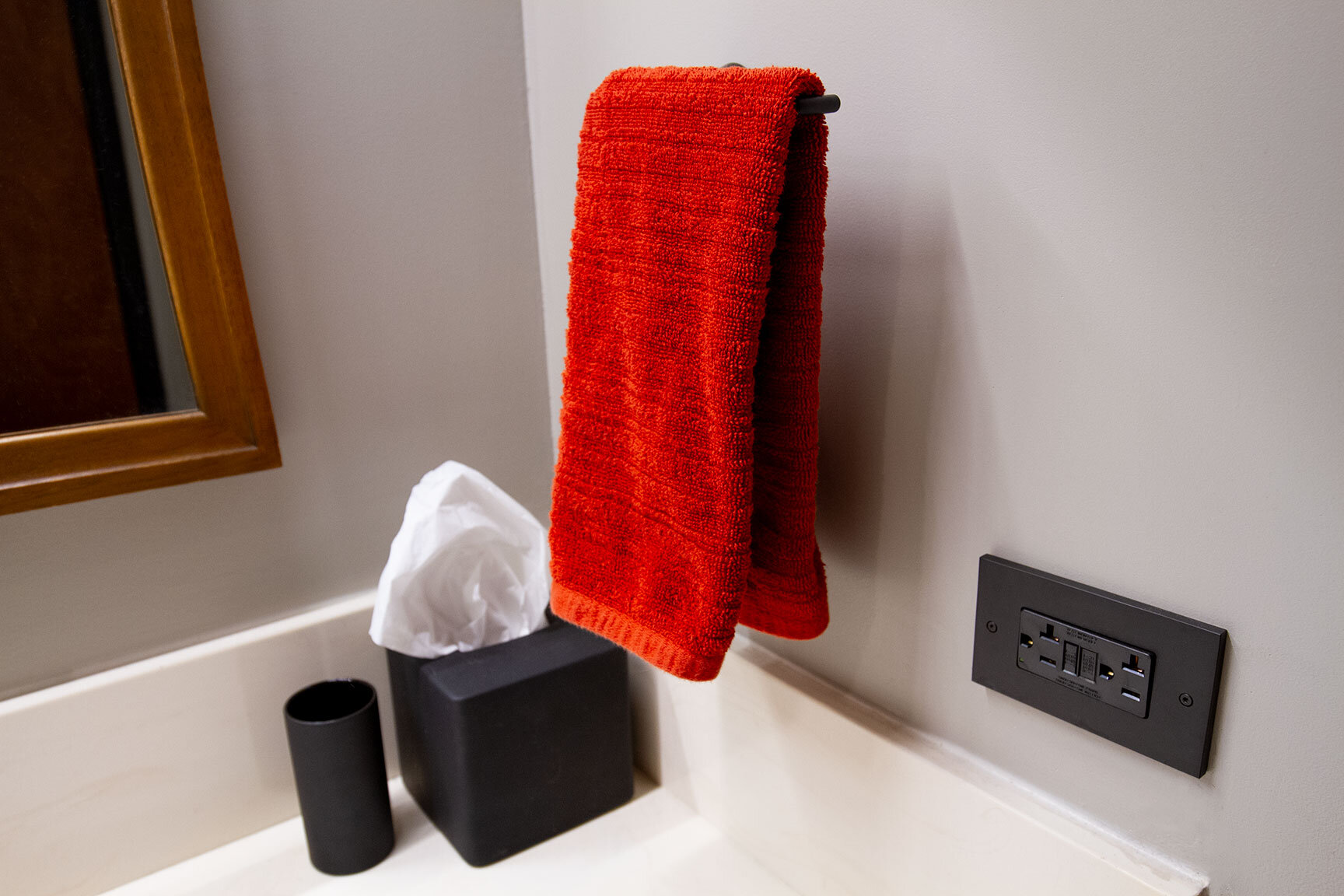
Things like towel bars and drawer pulls may seem like insignificant details, but they can have a big impact on the cohesiveness of your room. I swapped out my previous chrome towel bars and toilet paper holder for modern matte black pieces from CB2 (no longer available). The elongated bars follow the lines of the suspended bar pendant overhead, making the space feel wide and spacious.
Discolored, almond color plastic switch plates were swapped out for a high end brass option in matte black. The crisp edges and flush-to-plate screws provide modern sophistication and tactility. A small splurge goes a long way to make a statement every time you turn on the light.
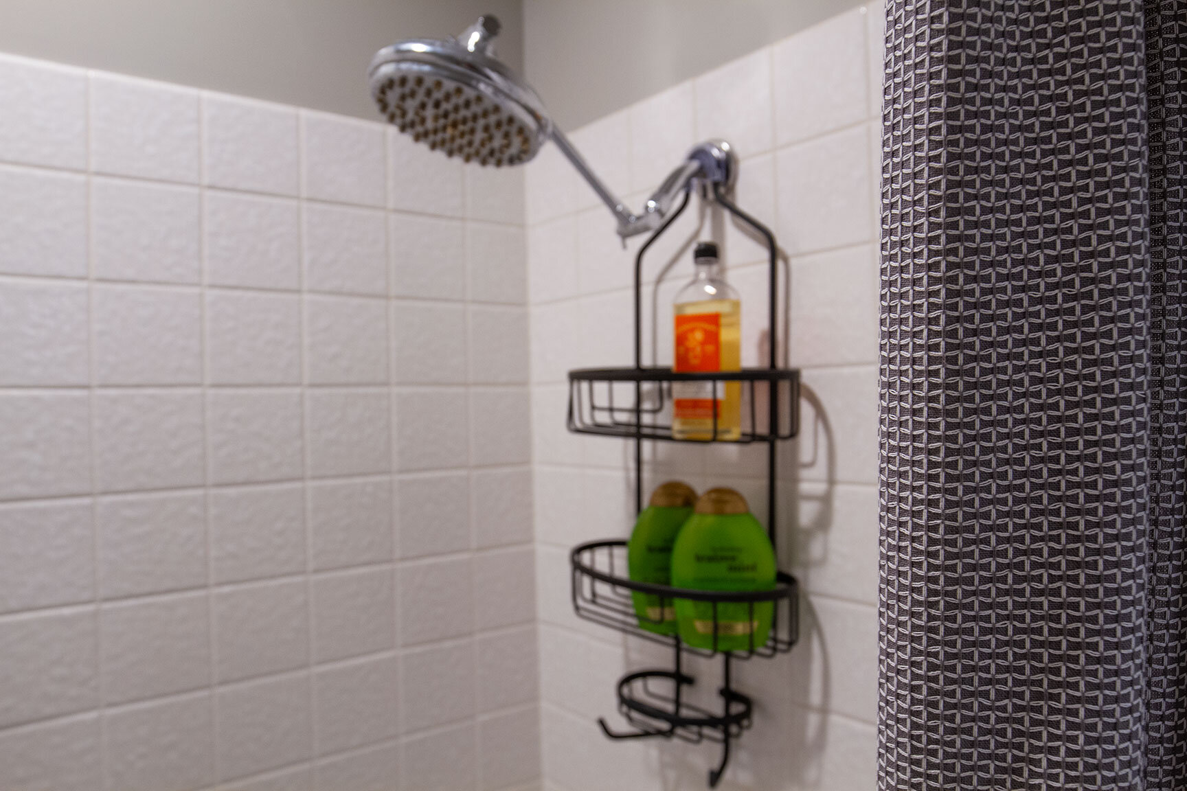
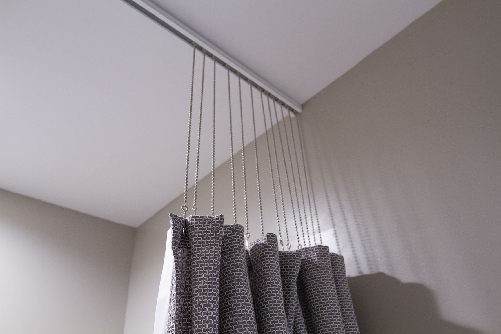
A fellow Streng Home owner pointed me to a fantastic shower hardware manufacturer who happens to be local to the Sacramento area. Thank you, Heather! Trax ceiling shower rods are what you find in many hospital and doctor office settings — a long metal bar with inset track and beaded extension chain. These have also gained popularity in residential design, particularly in modern home settings. While a standard shower rod breaks the vertical plane of a shower area at a lower level, making the space feel more confined and heavy, the ceiling mount rod system provides a vertical airy effect. Unlike a traditional shower rod with hooks, these chains glide smoothly along the track. At around $100, shipped to your door, this is a major upgrade that you will easily fall in love with.
Accessories
Luckily, bathrooms tend to be smaller spaces, so there’s no need to go bananas with the chotchkies and art. Just a few simple pieces can bring a splash of color and personality to your space. For items like shower curtains, towels, and rugs, Target has some outstanding finds that offer affordable modern style.
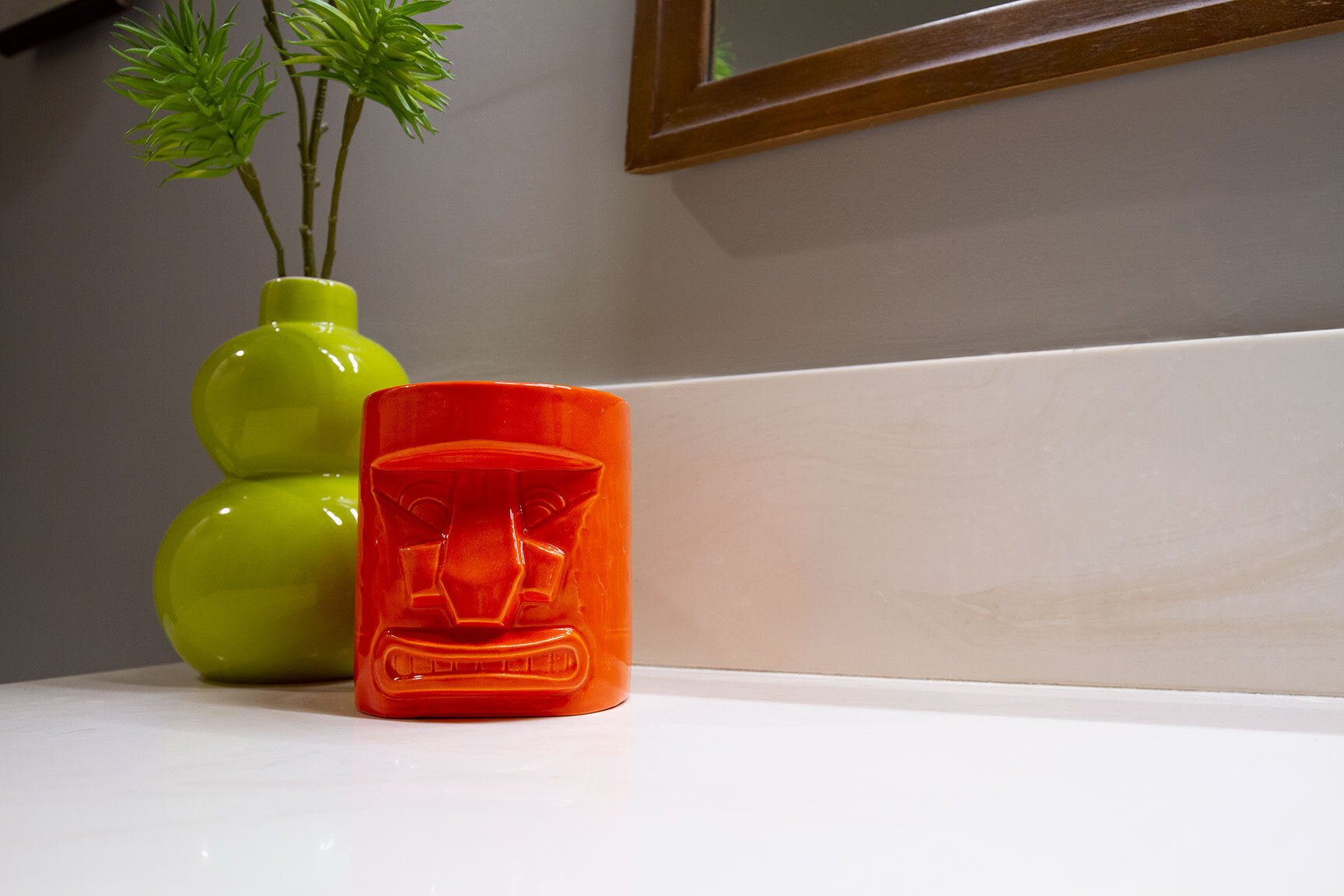
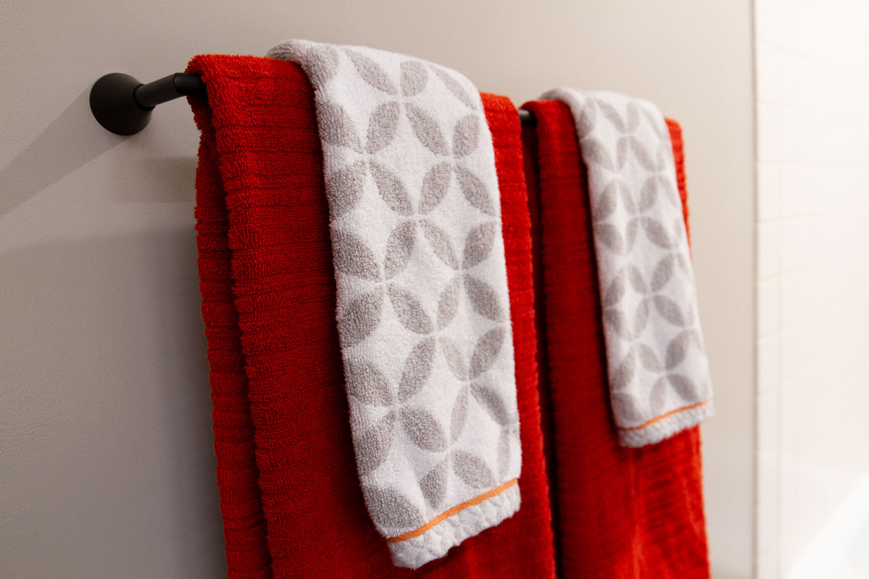
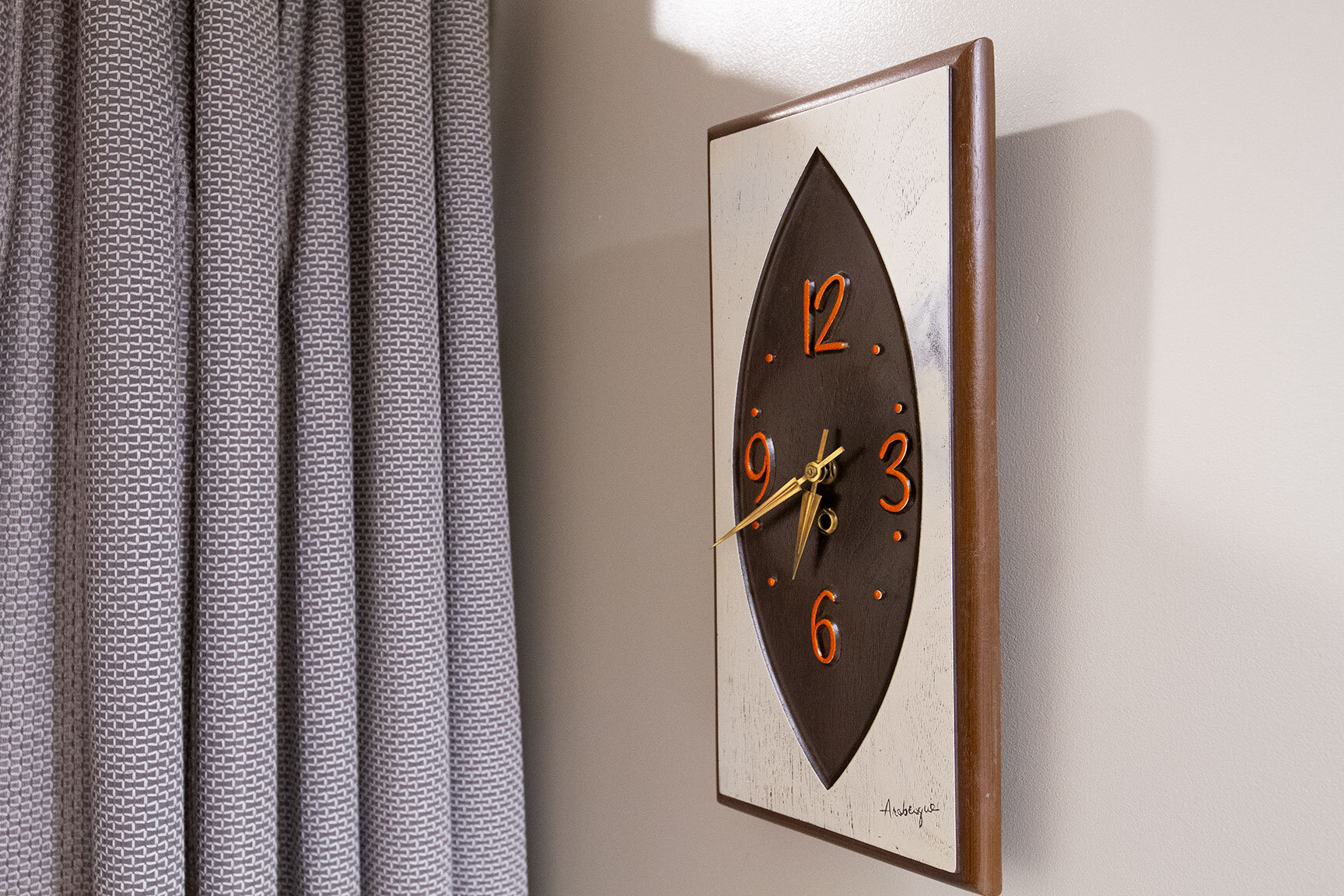
Your guest bath is likely very close to your guest bedrooms. To give the feeling of a second master suite, incorporate the same colors, patterns, and textures used in an adjacent bedroom into the bathroom. For instance, I replaced my original “wing swinger” 3-panel mirror with a vintage Broyhill Sculptra framed mirror. The mirror is from the same set as the headboard/footboard in the guest room, and carries the same warm walnut tones and subtle pinched curves for a touch of mid-century flair. These same playful arcs can be seen in the vintage Arabesque wall clock and starburst pattern hand towels. Accents of vibrant red-orange, chartreuse, and black stand out against the same Mindful Gray painted walls.
All of the changes you see here were done for under $1,000 (with the exception of the floors, which were tackled upon move-in). So with the guest bathroom looking sharp, and feeling fresh, I’m feeling pretty good about the state of this room for a while. When the time is right, I’ll be diving into more extensive renovations in the guest bath, so stay tuned!

