Defining Lines
Home Analysis
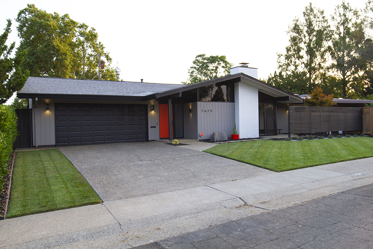
Since painting the exterior of my home in 2016, something has felt a little off. I would find myself going out to the road, looking at the house and questioning, “Does something need to change? Was it the paint? The landscaping?” I couldn’t quite put my finger on it. The color selections were just what I wanted, plants and accessories were mindfully placed, and the divider screen was a huge improvement. So what could be amiss?
Color in Question
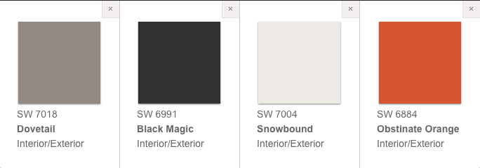
A great deal of consideration went into planning my home’s original color palette, so I was somewhat hesitant to make changes. However, when it came to trim, white was a generic go-to that didn’t require much thought. White trim is often used in home design as it brightens and modernizes edges for a neat and tidy appearance. While I have found that white trim works in many situations, I wasn’t married to it, and began imagining how my home would look with black trim (Black Magic) instead of white (Snowbound). I started by looking at some of Carter Sparks’ custom homes and original Streng homes for inspiration and found that most of them used dark stain or paint for trim, posts, and beams both inside and out. Standing back at the curb, I could see how this bold change might look on my home, but of course, to fully visualize the opposite, I would need to grab the brush and roller and get to work.
Magic Indeed
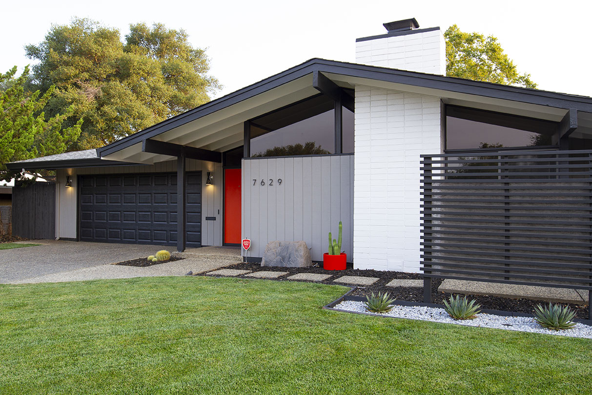
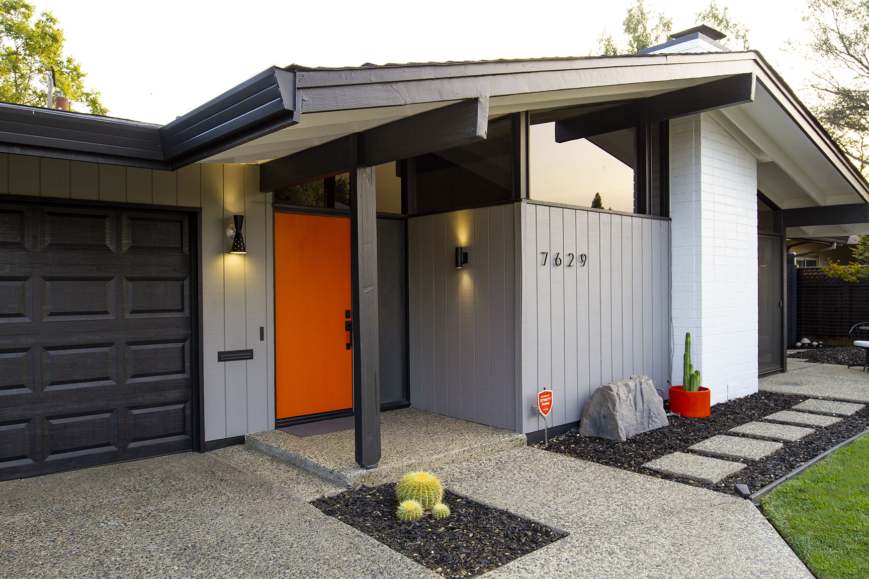
I started by painting the gutters, as those would be the most impactful lines of the house. Immediately, I could tell that this heavily defined line drew even more attention to my home’s dramatic roofline. Working my way from beam to peak, I became quite excited for where this was headed.
The contrasting white fireplace brick now had a hard line running through it, showcasing the intersecting planes that seem to splice right through one another. Painting the clerestory window trim suddenly made the segmented frames disappear into one continuous span of glass. Magic was happening right before my eyes.
Behind the Groove
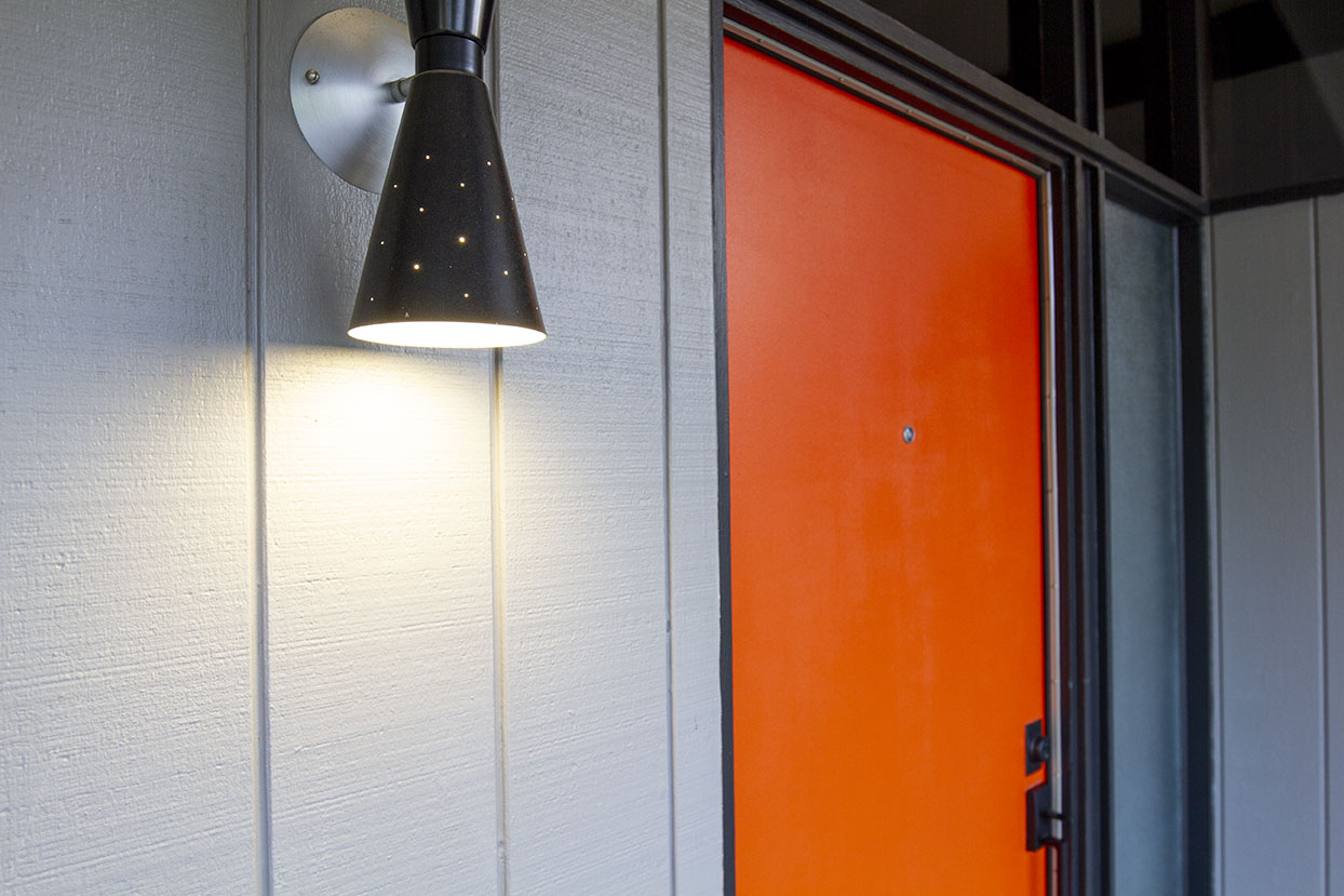
I feel quite lucky to have the original pyramid glass still intact at the entry of my home. I have seen a lot of renovations where this is knocked out and replaced with clear glass and a chunky vinyl frame. Truly sad. While my glass is in great shape, years of sloppy painting presented some challenges when it came time to paint the surrounding trim. The facets of the privacy glass were caked with white paint, and completely removing it was impossible. I didn’t notice the sloppiness as much when the trim was white, but now that it was black, the gnarly edges stood out like a sore thumb. I attempted scraping with a razor blade, x-acto knife, paint thinner and a wire brush, hot soapy water and steel wool — no way was this paint coming off. I decided to frame the glass with a 1/4” edge moulding (painted black, of course) on the interior and exterior. This thin trim was just wide enough to cover over the messy areas, making for a clean and finished look on all sides.
Weight and See
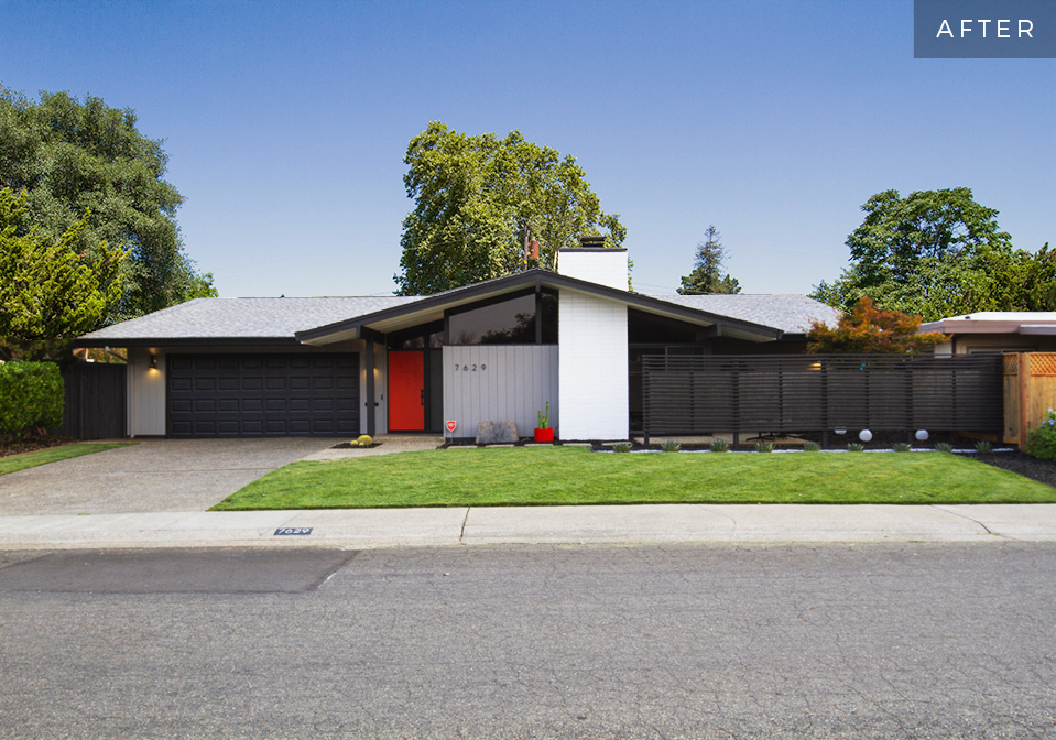
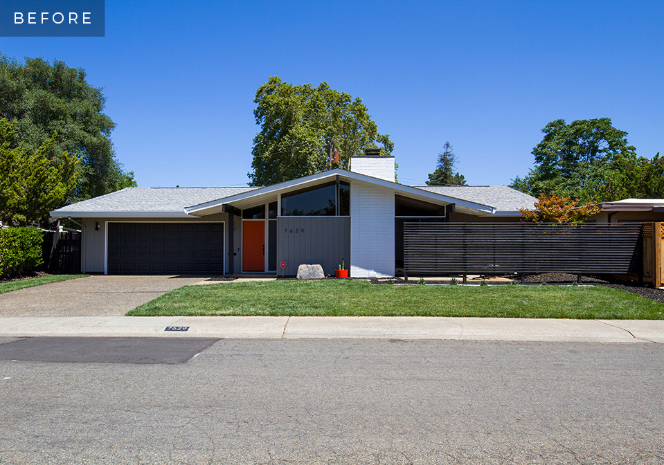
With all the trim and gutters painted, the difference is evident. While the color palette of the house remains the same, the home’s features are now showcased in a different way. Matte black hardware, numbers, and accessories feel more connected to the house. There is a distinct weight to the architecture with edges that are sharply defined, making the entire elevation feel more modern and unified. Passers by have been taking note right away. “Have you done something different to your house,” they say. Gone are those unsettling feelings and questions about what needed to be changed on the exterior. The revised scheme feels serene and cohesive with even more sophistication and curb appeal than before.
